
Sparklines - Excels Little Graphing Secret
Your complete guide to using Sparklines in your next spreadsheet.


Want to get the most out of this lesson? Download the sample data so that you can follow along.
I can’t tell you how many times a stakeholder wanted some sort of trendline next to data that I produced in Excel. It’s a common request that can bring about some serious frustration. It’s a simple question: how the heck am I supposed to shrink a chart into the size of a cell?
Luckily the good folks over at Microsoft provide us with an awesome tool that does just that: Sparklines. Put simply - a Sparkline is a small chart that is displayed in a single cell. They are much simpler than their cousins over in the "Charting Feature”. They physical exist in a cell and only display one set of data.
They adopted the idea of sparklines from Edward Tufte, a pioneer in data visualization. In his book 'Beautiful Evidence,' he introduced Sparklines as "data-intense, design-simple, word-sized graphics." Fast forward to 2010, Microsoft incorporated this concept into Excel, empowering users to showcase data trends in a compact, elegant, and comprehensive way.
Types of Sparklines
There are three main types of Sparklines to add a splash of color and context to your Excel spreadsheet:
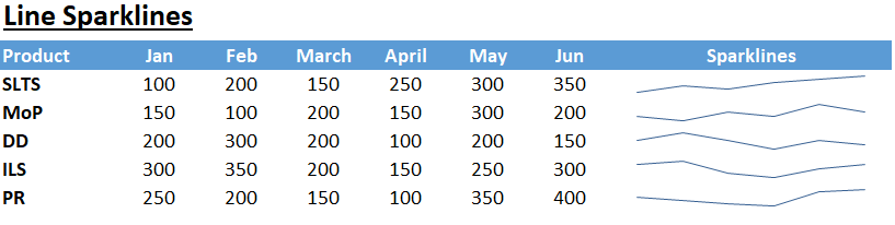
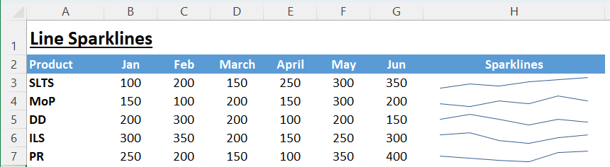
Line Sparklines: This type of Sparkline displays your data as a simple line graph. It's excellent for showing trends over a period of time in a condensed format. Each point on the line corresponds to a data point from your selected range, and the line's direction (rising or falling) indicates positive or negative changes in your data.

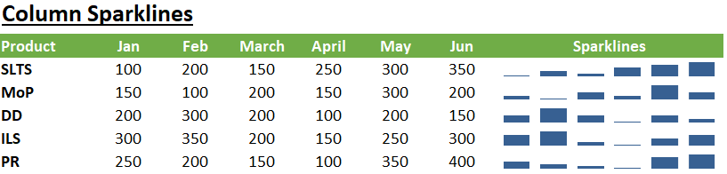
Column Sparklines: This Sparkline shows your data as mini column graphs. They are essentially bar charts within a cell and are excellent for comparing individual values against each other. Each column in the Sparkline corresponds to a data point in your selected range, and the height of the column represents the data point's value.
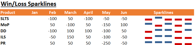
Win/Loss Sparklines: This is the most simplified version of Sparklines and is mainly used to show whether each value in your data range is positive (win) or negative (loss). These Sparklines don't consider the magnitude of the value, just its sign, and hence, are perfect for tracking performance (like win/loss or above/below average) across a range of values. Each column in this type of Sparkline is of the same height, and it's either above or below the axis, depending on whether the data point is positive or negative.


How to Insert Sparklines
Now let's get into the fun stuff - adding Sparklines to your spreadsheet. For these steps we will use the Line Sparklines. The same steps do apply for all of them.
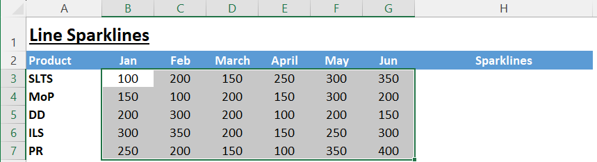
Select your data range: The first step in creating Sparklines is selecting the range of cells containing the data you want to depict.

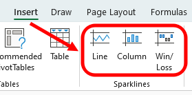
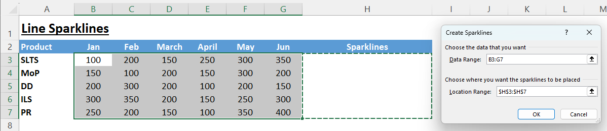
Choose the Sparkline type: From the "Insert" tab on Excel's ribbon, you can choose the type of Sparkline you want to insert (Line, Column, or Win/Loss).
Choose the destination cell: After clicking on the type of Sparkline, a dialog box will pop up asking where you want your Sparkline(s) to appear.

Time to finish: Once you’ve selected the location click OK. Voila! Your sparklines have appeared.


Making Sparklines Your Own
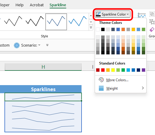
Once you have your Sparklines, Excel allows a wide range of customizations. To find the customization menu simply click on any sparkline. A special menu called “Sparkline” will appear in the menu.
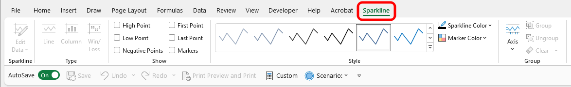
As you can see in the picture above this menu provides a TON of customization options for Sparklines. Lets dive into a few:
Changing Colors: Navigate to the Sparkline Color option in the Sparkline Tools section under the Design tab. Here you can choose a color that matches your presentation theme or preference.
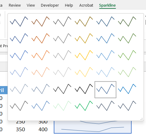
Adjusting Styles: Excel offers a variety of pre-designed Sparkline styles. You can find these in the Style gallery, also under the Sparkline Tools section in the Design tab.
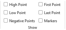
Highlighting Data Points: Excel allows you to accentuate individual data points in your Sparkline (such as the highest and lowest points, or negative values). These can be found under the 'Show' group within the Sparkline Tools section of the Design tab.
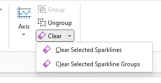
Clearing Sparklines: Even though the Sparkline exist within a cell, you cannot remove them by simply selecting the cell and clearing it’s contents. Instead you have to go inside the sparkline menu and select “Clear”. Then choose whether you want to clear a single line or the entire group.
Utilizing Excels Sparklines is a great way to add a little life to your spreadsheets. They also help convey a powerful message in a relatively small space. They offer a swift glance at trends and variations, all within the cell of a spreadsheet. It's a tool that combines simplicity, design, and powerful data visualization. Sparklines might be tiny, but they add immense value to your data representation.
Make sure you practice using Sparklines! This is easy to do - just download the sample data set included with this lesson and get to work. Apply what you have learned right away and it will stay with you.
I hope you enjoyed this lesson. There are a few other ways I can help you master Excel:
Do you have any burning questions about Excel that you want answered? Send your question to hello@learnexcel.live. I will address it in a future newsletter.
Do you or your organization need a little spreadsheet help? Book a 1 on 1 with me here.
Want to learn more Excel Shortcuts? I have created something special (and free) for you: The Best Damn Excel Shortcut Sheet
Til next time ✌️
-Ajay
The Excel Ninja 🥷
PS - If you like these lessons please share with a friend or two...